Your cover art is your first contact with the buyer, and the moment when you make or break a potential sale. If the buyer isn't intrigued by the cover, odds are they won't pick the book up and leaf through it. As a self published author, you need to have a cover artist on tap, or more likely to be able to do it yourself. This isn't as daunting as it sounds, certainly not as daunting as writing a complete novel, but it does require a new set of skills and a certain amount of capital investment. Let's take the whole process right from the beginning:
The Ne Plus Ultra of graphics software is Photoshop. It is not cheap, and it takes practice to fully employ its many features, but you can produce decent covers fairly easily, and its full potential will allow you to create dazzling cover art later on. (You can always go back and do a new cover for a book.) This is your best choice if you want to do art-heavy work.
There are other painting and graphics programs out there for both Mac and PC. These generally cost less than Photoshop, but their functionality and ease of use will vary. If you choose to go with one of these softwares, study their features carefully to be sure of what you are getting. In many cases, you can do a free download of the software to check it out, but you'll have to buy it to have its full functionality unlocked.
In some respects, the Mac OS X Pages word processing software is better for making covers since it can do much of what Photoshop can, and is more economical and easier to use. Pages can do some background, detail art, and font effects, but it is not as good as Photoshop in that regard. If you are doing simple covers, or relying on imported background images, this is your best bet.
The various editions of Microsoft Word are adequate for doing the text content of the book, but they are not as good as Pages for cover art, and much harder to work with.
In addition to the graphics software, you will need Adobe Acrobat with Adobe Distiller to prep the finished art for printing.
Your book's cover is your single most important selling tool since it draws in the casual passer-by, and makes him want to check out your work. Cover layout is an exacting art which draws the reader further in step by step. The following are some broad rules for creating an attractive cover:
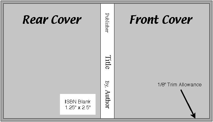
A standard book cover will be twice the width of the book, plus the spine width, by the height, plus 1/8" all around for trim. A typical 6" x 9" Trade Paperback of 100,000 words will run approximately 6.125" (rear cover) + .562" (spine) + 6.125" (front cover) wide, by 9.25" tall. When looking at the face of the cover, the book front is always on the RIGHT, and the rear to the LEFT.
Before starting a cover, be sure you have the final page count of your finished book so you can calculate the spine width. The major POD printers have free spine width calculators on line which will give you the exact dimensions you need. Since different printers use different weights of paper, always use their spine width calculator to be sure you get the correct thickness.
Color is an issue you need to be aware of, as the printing process handles light differently than a video display. This will cause color shifts in some instances, so what looks good on your computer screen may not look so clean and vibrant on paper. The two color formats you will be concerned with are:
RGB color - this is the format used for display on the web and in most E-book readers. Video displays build color by adding light, so the more red you put in, for example, the stronger and more vibrant the image will be.
GMYK color - this is the format used for POD printers. Printing works by taking light away: if you want red, you put down ink that absorbs everything except red. Art for POD printing must be formated as PDF/X-1a :2001, the printing industry standard, to insure that the colors come out as you want them. This is done with Acrobat Distiller after you have completed the cover JPEG.
These two different color strategies are each limited by their nature. Print, in particular, can't match the millions of subtle shades that modern computer screens can show. If the printing process can't match your video color exactly, it will fake it as best it can by layering different colors, so the result will often be a subtle shift from computer image to print on paper.
When making cover art, you will need to render it in RGB for downloads and GMYK for the print edition. You can set the color standard when working in Photoshop. For Pages, you will have to process the color later with Acrobat and Distiller.
The Background - Your background can be used to set the mood of the work: dark for drama, horror, and mystery; light for humor or adventure. Color themes can be used to express mood: reds for danger, greens for tranquility, etc. You can either use solid color or a general background image. A good source of these are the Public Domain photo collections found on line. These can form the entire background, such as a star field, although you will need stronger fonting if you do that. Using photo art can do a lot to set the mood of the work: a fog-enshrouded forest to give an ominous air of mystery, for example.
The Title - Potential buyers will scan your cover the same way we read a page: starting in the upper left corner, and tracking right and down. You want the title to catch them early, so it should be in a large, crisp font set in the upper part of the front cover. Ideally your title will be strong and brief, and will stimulate the imagination. Right below this will be any subtitle you want to add to pique the readers' interest further or link the story to a series.
Cover Art - Now that the Title has caught their eye, you want to follow up fast by giving them a visual image which builds on the mood and flavor of the story. This can be done even over a photo background, although it may result in a too-busy cover. One way around that is to fade the background image, which will make the feature image stand out. Feature images can be extracted from Public Domain photos. This is easiest to do in Photoshop by adding the clipped image to a transparent layer, then erasing around the edges. The feature image should be strong and action oriented, and should take up as much room as you can spare from the other cover materials. You can also add secondary images if they will better express the story line, but this should be done sparingly. A photo montage might be better for this.
Author's Name - Below the feature image, you should put "By, (Your Name)" plus any brief statements which further define the story. These should be centered on the bottom of the cover unless the graphics make it desirable to position it off side. In any event, keep the author material in one group, preferably in a vertical stack.
The Spine - The spine's only real use is to find the book when it is on a shelf, so it should be kept simple. At the top you should put the publisher's name (even if you are self publishing under your own imprint). The title should always be centered on the spine, with the author's name at the base. Try to balance these out as evenly as possible. The title should have the largest font, with the author's name in a medium sized font. The publisher imprint can be in a small font or a logo. In laying out the spine, always rotate the spine text 90 degrees CLOCKWISE.
The Rear Cover Blurb - The front cover serves as a quick-and-simple attention-getter to tell the reader that here is an interesting story. Once they have scanned the front, their first reaction will be to turn the book over and look at the back. The rear cover is your second selling tool, and it should focus on drawing the reader further in. The front cover told them there is something here: the rear cover tells them WHAT is here. This is done through the Rear Cover Blurb, a brief description which sets the story premise. Focus on the background, introduce the main characters, and describe the crisis they face in the most concentrated, distilled form you can. Writing good cover blurbs is an art in itself. As with the title, the Rear Cover Blurb should start near the top of the cover. You might add a small secondary illustration under this if it will help explain the premise, but avoid making the rear cover overly busy.
The ISBN Number - As a final step, add a horizontal rectangle of clean white 2.25" wide x 1.25" high without borders to the lower rear of the cover for the ISBN barcode. The POD printer will add a bar code at no charge. (See ISBN Numbers for further information.)
Keep in mind always that your cover is a marketing tool. You want it to catch the readers' attention, pique their interest, and build a sense of mystery as to what this book is all about. You want to do this quickly and with no distractions. At best, you have 30 seconds to make the sale, so don't dawdle. Keep your covers clean and focussed, without clutter and excess verbage. And aways remember that every element of the cover should draw the reader deeper in.
In selecting image and font colors, it is important to remember the 'Rules Of Tincture'. These were first developed in the Middle Ages for heraldry, and apply even today. In tincture, there are two groups: 'Metals' - Silver (white or gray) and Gold (yellow); and 'Colors' - Red, Blue, Green, Purple, Orange, and Black. The Rule Of Tincture is never put Metal on Metal or Color on Color. 'Metals' are light, 'Colors' dark. By alternating them, you get the best contrast and the clearest font, image, etc. As a rule of thumb, light colors stand out better, so your title fonts should be white or light colors if possible. In any event, go for maximum contrast.
When doing paste up in both Photoshop and Pages, the various elements will float separately, and can be manipulated without affecting the rest of the image. In Photoshop, this is done with 'layers' - your title header will be on its own layer, for example, and by selecting that layer, you can work on it without disturbing the rest of the document. In Pages, elements such as imported graphics or text boxes are loose on the single page, and can be moved about as desired. If you go with another graphics software, be sure it has some sort of layering or independent element moving feature.
When setting the elements of your cover, keep in mind that there is a 1/8" trim allowance all around. If you want an object to be 3/8" from the finish edge, set it 1/2" in on the layout. Centering items on the front or back cover can be tricky since you need to remember that the items centered will each need to be offset 1/8" inboard.
Try to keep all elements at least 1/4" away from the edges - 3/8" is better. You can set your background or secondary images so they spill off the sides or around onto the back cover, which is called 'bleed'. But avoid this for font work or feature images, as it looks amateurish.
Try to strike an artistic balance of features. The usual practice is to center the feature image and build the rest of the cover around it, but this is not a hard-and-fast rule. You might, for example, have one character entering the cover scene from the right edge, and another leaning against the left edge, although you will have to be wary of bleed alignment on the spine. Dominant images can be placed high and to the right, which makes them more prominent and implies greater importance. The reverse is true for lesser images. Relative image sizes are another means of focussing attention on the feature image. In any event, don't hesitate to experiment with layouts, colors, backgrounds, fonts, and all the rest until you get exactly what you want. You aren't being paid by the hour for this, you know.
Now that your cover art is complete DO NOT FLATTEN THE LAYERS. The artwork will export easily without this step, and you want to keep the original art file in its layer form for later revisions.
Once the cover art is complete, it must be converted into a PDF file for the book printer. One issue with PDFs is the inclusion of fonts and images. This is usually done automatically, but unusual fonts or shadow border images may be left out. If that happens, they may not show on the finished PDF, or worse, on the printed book.
To avoid this, Save a copy of your completed cover as a JPEG. This will 'rasterize' all the elements, converting them into just that much more picture. After saving, run the JPEG through Acrobat Distiller. Be sure the JPEG is saved in GMYK, or you will get an error message from Distiller. If that happens, convert the file using Photoshop or Acrobat. This will make sure you have the correct color balance, and will convert the file if necessary. Once you confirm that, Distiller will export the file to PDF.
You will also need to export the cover as an RGB JPEG for your download files. This can also be done with Photoshop or Acrobat.
Sadly, some of us lack the basic skills to do decent cover art, or have greater ambitions than our common sense can manage, in which case, one can turn to commercial artists. A source I have found is Upwork.com. This site is a free service which allows one to post requests for free-lance work by artists, programmers, etc. A recent posting there resulted in some thirty responses, a half-dozen of whom look like real possibilities. The bids quoted were surprisingly cheap for such quality work (the bids, quality and artistic styles vary widely). The site acts as an escrow agent, and can draw funds from PayPal if desired.
When using Elance, don't grab the first offer to come along. You will want to discuss your project with several bidders to be sure you get what you want at a predictable price. Also be sure that you are buying the Rights to your work free and clear. For that matter, images made from your concepts are Copyright by you in turn. You can have complete covers made for you, or individual images you can paste up in your own artwork.
Related Topics:
Prepping For Print
Index - Small Press Services
- Author Services - Artist
Services - Site Map
Cover Art
Basics Of E-publishing
Prepping To E-publish - Jutoh For Mac
Prepping To E-publish - Legend Maker For Mac
Roll Your Own - CD Books
Spread The Good Word - Audio Books
Fixing Those $%#*! Software Problems